7 Deadly Decorating Sins You Absolutely Want To Avoid!
This post may contain affiliate links. If you make a purchase through one of my links, I may make a small profit at no expense to you. For further information, please view my policies.
7 Design Sins You Need To Know About
Whether you live in a dorm or a mansion, these are the 7 worst decorating mistakes you will definitely want to avoid making.
Today we are going to pull the curtains back and EXPOSE the top decorating mistakes that will do the most harm to the overall look of your home.
Don’t feel like reading?! Watch the video here!
1. all your furniture is pushed up against the walls
Ok, this design sin is easy to misinterpret and a lot of people get upset over it.
Usually the mistake looks something like this:

(The blue squiggle is there to draw attention to all the empty space!! I realized after I uploaded this picture that maybe that wasn’t obvious😅)
When designers say not to push your furniture flush up against a wall, they’re mainly referring to when it’s done with large upholstered pieces, and usually it’s in the living room or in a den or family room.
When you push your big upholstery pieces up against the wall, it creates a big empty void in the middle of the room. (See blue squiggles above 😂)
This doesn’t look good, it isn’t effective as a layout, and it makes socializing with others in the space awkward as well.
Here’s an example of a good before and after where this problem gets addressed:
The ideal socializing distance between two people varies from culture to culture, but generally in North America, a comfortable, friendly distance is approximately 2 to 4 feet. If you’re forced to be closer than that, it can feel weird – unless you’re on more intimate terms with that person – and if you’re further away it also feels uncomfortable. So remember that sweet spot when you’re laying out the seating areas of your home.
2. Forgetting about grout color
If you’re about to tile a new kitchen backsplash or lay tile in your new bathroom, the worst thing you can do is spend weeks agonizing over what tiles to use and how to lay them, and then leave the grout color as an afterthought. Your grout color should never be a last minute, panicked decision.
You may be thinking – well that’s easy, I’ll just go with the classic white tile/white grout look, how can you go wrong?
Well…you can.
First of all, white grout does not stay white forever. Most people that choose white grout actually end up regretting their decision a few years later, so keep this in mind.

If dirty grout drives you bonkers, just consider that you may have to go to great lengths in order to restore the pristineness of your white grout, so you may want to save yourself the headache and consider going with a grey or beige instead.
If you are stuck with dirty white grout and you need a fix, FAST, there is one: it’s called a grout pen, and it DOES work. Click on the image below to buy:
Second, let’s talk about this example. The top is with grout, the bottom is without grout.

This homeowner had her tiler painstakingly lay her tile in a beautiful spiral pattern, and then she chose a white grout. The tile pattern completely disappeared because she picked a grout that didn’t provide any contrast. Halfway through the job she realized her mistake, was super upset and then had to mess around wasting time and money figuring out how to fix it.
Give your grout the time and consideration it deserves!
3. hanging bad art
Before you get angry at this extremely controversial and opinionated statement and click away, just hear me out. 😂
If you’re designing a room and you want it to look good, you can’t ignore the walls. What you hang on your walls is super important!

From an interior design standpoint, of course, your art should be in harmony somewhat with what is going on in the rest of the room. But to truly nail your art game, that’s still not quite enough – the art also should also be meaningful to you in some way.
This is why hanging generic art is not … great …. and why it can really bring down a space.
This is also why people often resort to hanging mirrors – it can be tricky to commit to picking art. Of course there’s nothing wrong with hanging mirrors! I just mean it’s easier.
So what is bad art? “Bad” art is any art that doesn’t work with its surroundings, and that you hung simply to fill a space on your wall.

THE BEST art is art that looks good with its surroundings, and that has some kind of significance to you. This is all you need to remember.
Well, also you should remember to actually hang your art properly as well – but I talk about that in another article…
Meaningful art doesn’t mean that it has to have to have some crazy unbelievable back story, it just needs to not be completely generic. Just try find ONE extra reason to hang a piece of art beyond just ‘the painting matches my sofa’!
And just a reminder – the cost of the art on your walls is totally irrelevant; you can buy your art at Home Goods, Walmart or the Salvation Army. It can be a print or it can be an original.
So long as a) you love it and b) it works with your room, you’re golden.

Some art that I personally tend to stay away from are mass produced prints of recognizably famous paintings and landmarks, altered classical art – that’s just a huge personal pet peeve of mine. Also those black and white photos where just one element has been left colored, or landscapes with super saturated colors, like sunsets – i find that stuff kind of cheesy – … but again, that’s just me, if you love any of those things and they work with your room, then you do you.
I can hear you saying:
“But VIV! What happens if I love the art but it doesn’t work with my room???!? What then????“
Well then maybe that piece of art could be the jumping off point for the rest of your room’s scheme. Take cues from the colors, and bring those into the rest of your room to really make everything sing.
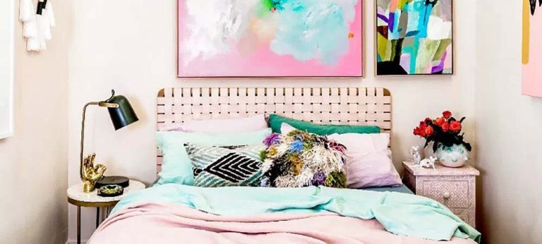
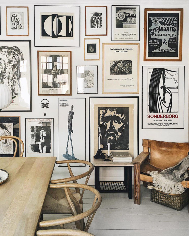
Below are a couple of examples of what I mean: look at how well-integrated these art pieces are in these spaces. Each room pulls colors from the art, and the furniture and wall color is also in the same general color family as the art, which makes it all feel cohesive.

4. Buying small rugs
The too small rug mistake is one of the easiest mistakes to make for 3 reasons:
1: when you’re buying, the smaller size is tempting because of course it’s cheaper.
2: many people don’t measure before they buy.
3: many people just don’t know the basic guidelines for rug sizes.

So let’s go over the basic rug sizing guidelines:
- When you’re considering a new rug, first of all, always place out all your furniture first. And THEN measure for your rug
- For a living room, an area rug should fit under all of the key furniture pieces. You should be able to fit at least the front legs of major upholstered pieces on the rug, the back legs can be off. Typical living room size rugs are 8×10, 9×12 and 10×14.
- For really large rooms, you can also use different rugs to create different zones, provided that the rugs coordinate well together
- In the bedroom, for a queen size bed the most typical size is an 8×10 but if your room is on the smaller side you can use a 6×9 as well. For king size the most typical rug size is a 9×12. Some people like to put their nightstands on the rug, some don’t. I prefer not to, so that I can enjoy seeing more of my rug at the foot of the bed.
- For a dining room area rug, make sure all your dining chairs fit on the rug, and get a rug that extends at least 8″ out from each side your table.
If you already have a too-small rug and you’re stuck with it, then you can save the situation by layering it on top of a larger natural fiber rug.

Layering also works really well for situations where you’ve fallen in love with a rug that’s a little too small for your space. Or maybe because you’re saving up to buy a new large rug for your room but you’re not quite there yet.
Jute rugs work great for layering, because the big sizes are affordable, they’re a lovely neutral-toned base and they match with pretty much anything you place on top.
5. Curtains are hung wrong
98% of every home I see has their curtains hung in a way that designers would say is … wrong. Curtains are an incredibly important element of a room so not getting them right is a real shame!
I do get why most people don’t love hearing this, because curtains are super annoying to get right, it’s a hassle and an expense to change them.
But if your curtains are floating a foot above the ground, they’re hung wrong.
If your panels look skimpy like the ones in the picture below, they’re not adding to your room’s look.

If your rod is hung too low, that’s also considered wrong.
And finally, if your rod doesn’t extend out enough past your window, you guessed it, also … wrong.
And remember, when we say “wrong”, it’s not to pass judgement or make anyone feel bad, it’s just a word to say that your curtains are not helping to make your room look as good as it could look.
I’ve done two full videos on how to hang curtains so definitely check them both out if you are wanting more information – I’ll embed them below so you DON’T EVEN NEED TO LEAVE! Or read the article here.
6. Buying big ticket items with distinct patterns
If you’re thinking of buying a sofa or an accent chair, think reaaaal hard before you spend your hard earned cash on a very bold pattern, or a wild, unusual color.
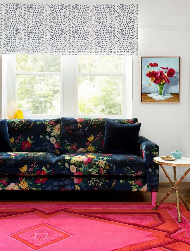
A sofa is a pretty huge purchase and because of that, chances are you’re probably going to want to hang onto it for a long period of time.
I always recommend going neutral when purchasing large upholstered items. Neutral is classic and elegant and is the perfect backdrop for playing with pattern and color with SMALLER, less expensive items, like throw pillows.
If you’re dying for that floral patterned accent chair – I get it … floral upholstery is definitely having a moment right now!! – just make sure you go into the purchase with your eyes wide open, knowing that you might get tired of it sooner than you thought. If you’re not worried about your taste changing, or you think you can resell it a few years down the line, then go for it!
OR … buy second hand so that once you get tired of it, because you will get tired of it, then you won’t cry when it’s time for it to go.
RELATED POST – HOW TO DECORATE USING PATTERN !
7. Not layering your lighting
Having only one light source in a room, for example one that is placed right in the center of your ceiling, is a very common design mistake.

Unfortunately, there is no single light fixture that can fulfill all of your lighting requirements alone.
Well-designed lighting schemes include layers of different kinds of lighting: namely ambient lighting, task lighting and accent lighting.
Ambient lighting is the general, overall light that fills the room.
You get your ambient lighting from overhead light sources, either with one fixture or several, from sconces on the walls around your perimeter, from cove lighting. Light from your windows and skylights is also considered ambient light.
Task lighting is what you use when you need to focus on something specific. So for example when you’re reading hopefully, you’d have a lamp nearby, or when you’re preparing food in the kitchen you could have undercabinet task lighting.
Accent lighting is about highlighting things that are already in your space, like art on the wall. And as a general rule, your accent lighting should be about three times brighter than the surrounding ambient lighting for the best impact.
Also it’s worth noting that sometimes your task and accent lighting is bright enough to produce ambient light.
The point is, don’t just use one light bulb!
So that’s it – some design sins that now you know about, you can avoid at all costs. With that knowledge, go forth and design something creative and beautiful! And if you ever get stuck along the way, Posh Pennies can help guide you through it – leave a comment, we’re always here to lend a helping hand! 🙂


