Learn How to Mix Patterns Like a Designer!
This post may contain affiliate links. If you make a purchase through one of my links, I may make a small profit at no expense to you. For further information, please view my policies.
Adding a new pattern to your home’s interior design can help breathe new life into a room like nothing else!

Combining patterns might seem like a very complicated task, but with the right tips, it can become a fun and fulfilling experience!
Read on to find fresh tricks on mixing different patterns and fabrics that will help make your home look brand new in no time.
Where to use patterns in a room?
Generally, patterns in a room will commonly be found in:
- curtains
- throw pillows
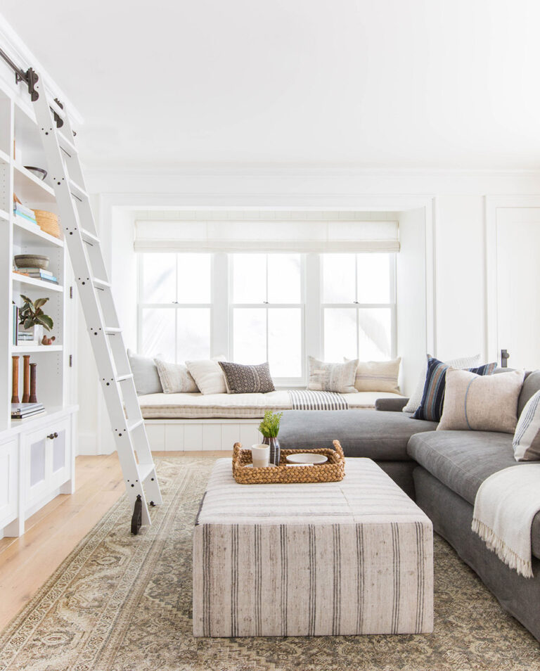
- rugs
- wallpaper
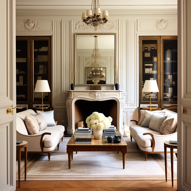
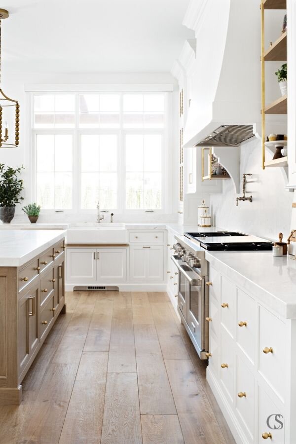
- in some of the upholstered pieces (although I would tend to recommend staying away from buying large pieces in patterned fabrics and just stick to neutrals – I talk more about this in my video about how to make your home look more expensive here).
But I feel it’s important to mention that if you’re decorating a room right now and you’re stuck on the pattern choices, you don’t HAVE to pick fabrics with patterns! You can just as well pick fabrics that are a solid color. More on that below.
Stick to 3 patterns
Ok so you want to introduce patterns into your room. The first thing to keep in mind is that you will want to choose no more than 3 patterns.
Of course, this rule can be broken! But if it’s your first time mixing patterns, then I would strongly recommend sticking to just 3 patterns in one room to start with!
As you gain confidence with pattern mixing, you can venture into the fascinating realms of 4+ pattern rooms. 😁 But for now, stick to a maximum of three.
Help! Which patterns should I pick?!
Start by picking a pattern you love. That first pattern will be your basis for your other 2 pattern choices. This pattern could be your large-scale one. Make note of whether your first pattern is a more geometric type pattern, or a flowing, more organic type pattern.
Note – there is more information on SCALE & COLOR below! Make sure you read that before making your selections 🙂
Then pick a second pattern, and make sure it’s within the same color family as your main pattern, or coordinating with your room’s color scheme. If your first choice was geometric, then this second pattern could be organic (and vice versa).
Your third pattern will also be in the same color scheme as your first two. So it should contain either some of the same colors from the first two patterns, or should be complementary to the first two. But the scale should be SMALLER than the other two patterns.
Depending on the look you’re going for, your third pattern could be the fun accent pattern, like a cheerful polka dot or something similarly whimsical.
Your pattern color scheme
Obviously you want your patterns to work well together! You don’t want it to look like you walked into a fabric shop with a blindfold and just picked three randomly colored patterns.
Your best bet is to keep pastel colors with pastel colors. Strong, saturated jewel colors will work best with similar strength colors. And muted earthy tones always work well with each other. In short, you should be choosing colors that match in intensity.
If you already have the paint figured out in your room, then you will definitely want to keep that paint chip handy while you’re fabric shopping and planning your patterns.
It can be a little easier if you’re starting the room from scratch, because the colors of the patterns you choose might actually end up determining the rest of the room’s palette. But don’t worry if you’ve already got paint and furniture – you can easily work around what you already have in the room!
One thing is for certain though: your patterns should coordinate with your paint and furniture, regardless of the order in which you make your decisions!
Your first pattern is the most important. It’s going to be the one that hopefully has your favorite colors. You also want your patterns to echo any other color you might have going on in adjacent rooms. So for example, if you have a primarily greige dining room, and your living room is right next to it, try to incorporate a little of the same greige into your living room patterns. Your paint chip is always your best friend!
Play with scale
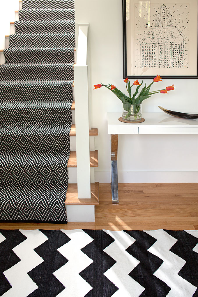
One of the keys to successfully mixing patterns is to vary the scale. If you have 3 patterns that are all the same scale, your room is very likely going to be boring and fall flat.
Here are some scale formulas that work well:
- one large scale pattern, one medium scale pattern and one small scale pattern.
- one large pattern and two medium.
- two medium and one small.
- one medium, one solid, one small.
Variety is key!
So as an example: if you’re designing a bedroom, you could choose a large-scale pattern as the dominant pattern for the room, and you could use it on the bedspread, rug or the wallpaper. As a second pattern, you would choose something about half the size as the first, in a totally different pattern (but still within your color scheme). And the third pattern would be the smallest but it would be similar to one of the first two patterns used.
Now let’s look at some of the different types of patterns that exist and let’s try to categorize them. I’ll also try to lay out what works with what.
Solids
Obviously solids are not a pattern, but they play an important role in a room’s pattern scheme. As I mentioned earlier, one or more of your fabrics could be solids. The great thing about solids is that they match with virtually anything (pattern-wise). A solid fabric can give your eye a moment to rest between the other stuff that’s going on.
Just remember to keep your solids within the color scheme you’re working in.
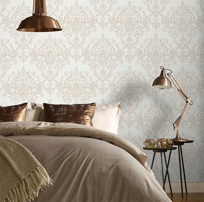
Traditional patterns
If you want to freshen up your home and you are drawn to a more traditional style decor, you could try using damask, striped or toile patterns.
All of these more traditional patterns mix well with each other, with solids, and also with floral patterns.
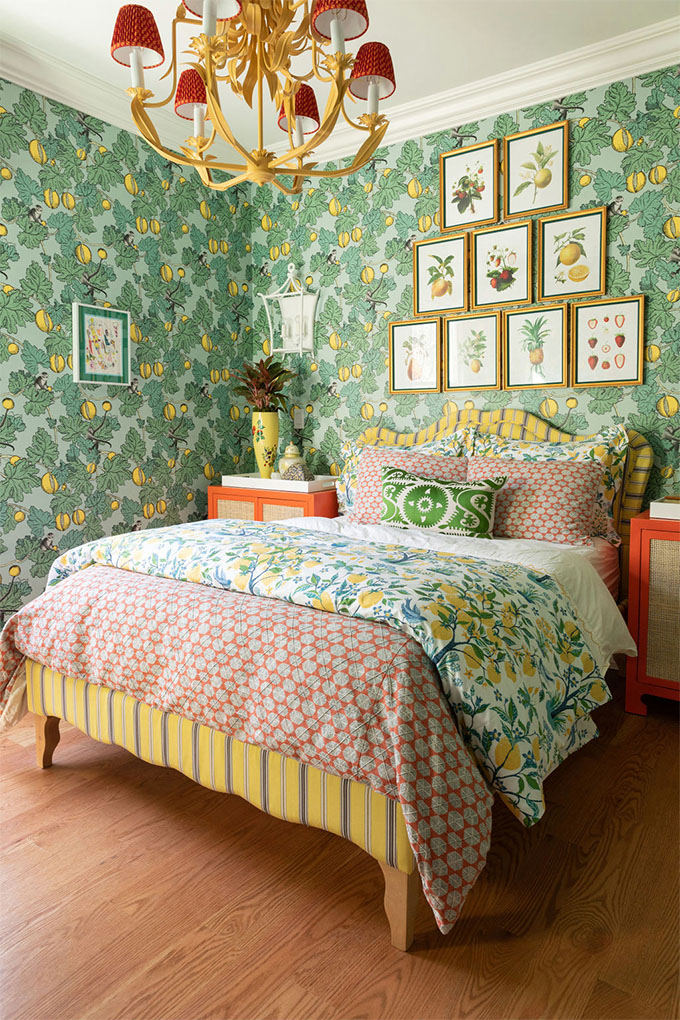
Damask
Damask is an ancient pattern (it dates back to the early middle ages!) that gets its name from the city of Damascus. It’s an organic, flowing style, that often features repeated patterns of flowers, fruit, and other designs.
I’m 100% positive you have seen this pattern before somewhere!
This is what one example of a damask pattern looks like:
Stripes

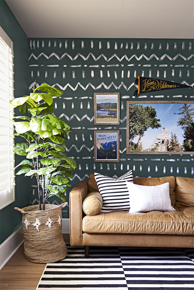
Stripes come in vertical, horizontal, thick, thin and variegated. They can be monochromatic or have more than one color. Stripes are considered a timeless, classic pattern and go with just about anything. They are quite easy to work with so definitely consider stripes as one of your patterns if you are drawn to them!
Though there is a design rule to never use more than 2 stripe patterns in one room, when this rule is broken by experienced designers it always seems to look amazing.
Toile
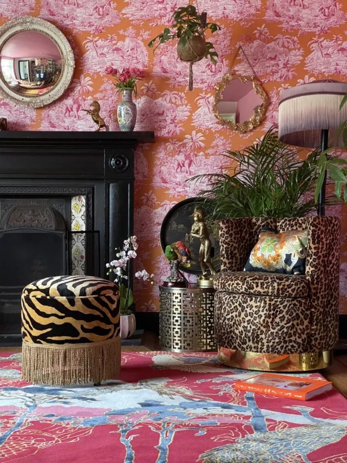
“Toile de Jouy”, often abbreviated to “toile”, is a type of decorating pattern consisting of a white or off-white background on which is a repeated pattern depicting a fairly complex scene, generally of a pastoral theme such as a couple having a picnic by a lake.
The red and hot pink wallpaper pictured above is a very glamorous take on the traditional Toile, but probably not what you would want to choose if you were going for a more traditional look (in that case stick to the light background). 😉
Geometrics
This category may seem pretty huge, as there is truly an infinite number of geometric patterns.
But really, geometric patterns can mainly be broken down into either angular or curved. And like most other patterns, they can be found either small or large. That’s it!
Some examples of popular geometric patterns are herringbone, chevron and the good ole greek key.
One easy way to mix multiple geometric patterns is to choose patterns with a similar thickness to the lines.
I personally find the use of certain geometric patterns a little dated now, and prefer using more abstract combinations of geometric shapes, or geometric shapes that are reminiscent of art deco or mid-century design.
Exotic patterns
Shibori

If you’re tired of more traditional patterns you could try opting for something entirely different: shibori fabric.
Traditional shibori fabric comes in different shades of blue. However, if that’s not what you like, you can opt for any other color as a background for these elaborate patterns.
Decorating with indigo shibori was extremely popular a few years back but now the trend seems to have waned. Though the use of subtle Japanese patterns can still work really well if you’re decorating a japandi style space.
Ikat

If you don’t like shibori, you could introduce an Ikat pattern instead. Ikat is actually one of the oldest forms of textile decoration, and is most prevalent in Indonesia, India and Japan (where instead it is called Kasuri).
Paisley
The paisley pattern is of Persian descent and consists of a teardrop-shaped motif with a curved upper end. For all the boho lovers out there, you could consider incorporating paisley as one of your patterns (Ikat also works well in boho interiors).
Much more info on boho decor here!
Floral patterns

If you aren’t into orderly geometric shapes and would rather go for something wild and natural, then floral can be a great choice.
Floral patterns can at times contribute to giving a romantic, feminine vibe to a space, so keep this in mind when introducing this type of element (in case this is not what you intended!).
You can put florals on pillows, comforters, furniture, or even go all-in and use floral wallpaper. Florals combine excellently with many different types of patterns, provided you stay within your color scheme.
Animal prints
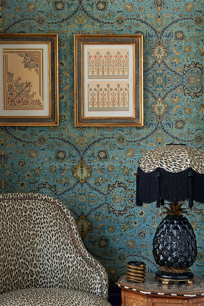
Animal prints definitely also fall under the “exotic” category, but they are so unique that they really deserve their own category. Animal patterns can really help give your space that eclectic or glam edge.
As these patterns can be quite dramatic, I would generally recommend going easy with them! One animal print element is probably more than enough in one room. However, if you’re feeling particularly daring, animal prints actually tend to pair well with other animal prints, so try experimenting! They also pair well with other bold, graphic prints.
To witness a master of mixing extravagant animal prints with just about anything else (namely florals and chinoiserie), check out Wendy Morrison. A true delight for the eclectic lover!
The key to extraordinary interior design is letting yourself relax and letting your imagination run wild. With some practice, you’ll be able to come up with some really innovative pattern combinations. The end result will make your home feel more personal and look more beautiful than ever!