Dulux Color of the Year 2022 is the Most Beautiful Blue
This post may contain affiliate links. If you make a purchase through one of my links, I may make a small profit at no expense to you. For further information, please view my policies.
The Dulux color of the year for 2022 has just been announced and I’m EXCITED! I’ve been very drawn to pretty much this exact shade of blue for quite some time!
The color is called “Bright Skies” and is described by Dulux as “an airy, light blue”; it perfectly captures the optimism and desire for a new beginning that is currently in vogue.
Bright Skies is a pale, dusty blue that reminds us of an endless sky on a clear winter morning, when there are no clouds to limit our sight or block out the sun. In nature, blue usually reflects tranquility and calmness but this particular shade – with its hints of grey – also conveys sensitivity, trustworthiness and responsibility.
How to use Dulux Bright Skies
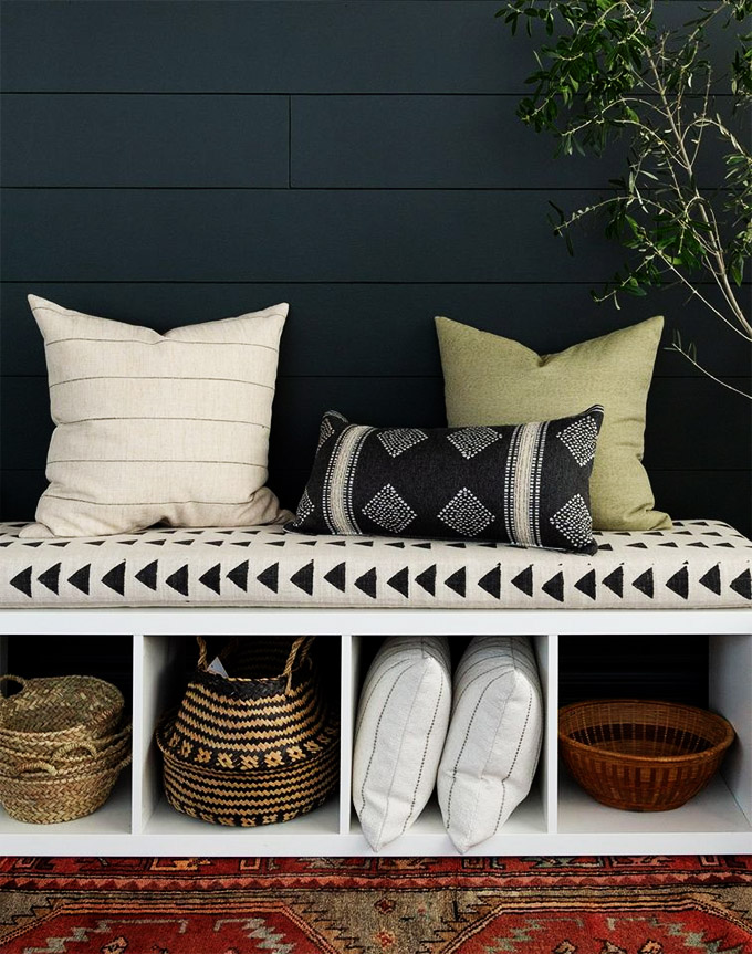
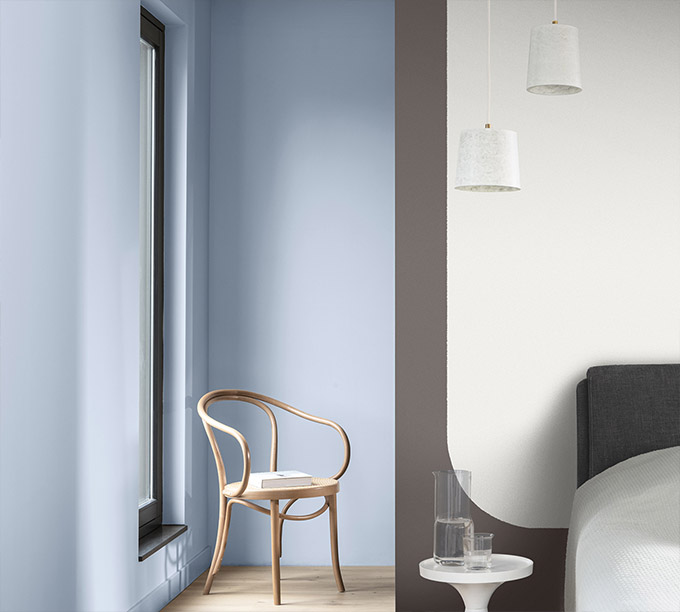
When using this color I would tend to lean towards creating calming and peaceful spaces. This may be through the use of natural elements such as light wood furniture, pale stone tiles and soft textiles in creams, blues and greens.
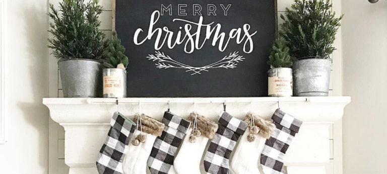
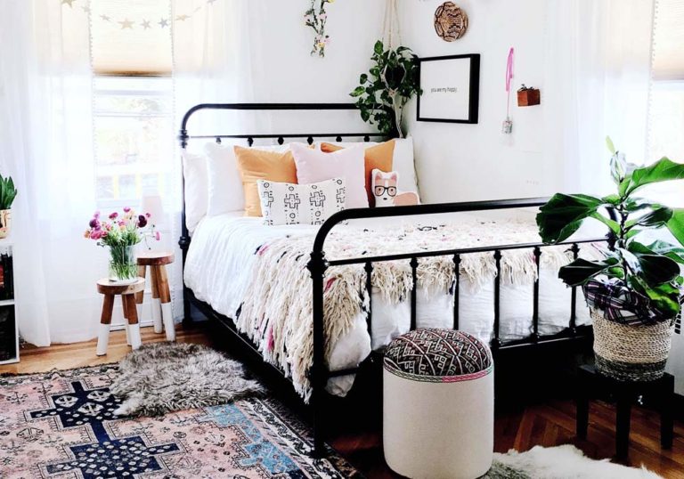
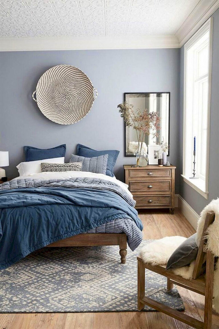
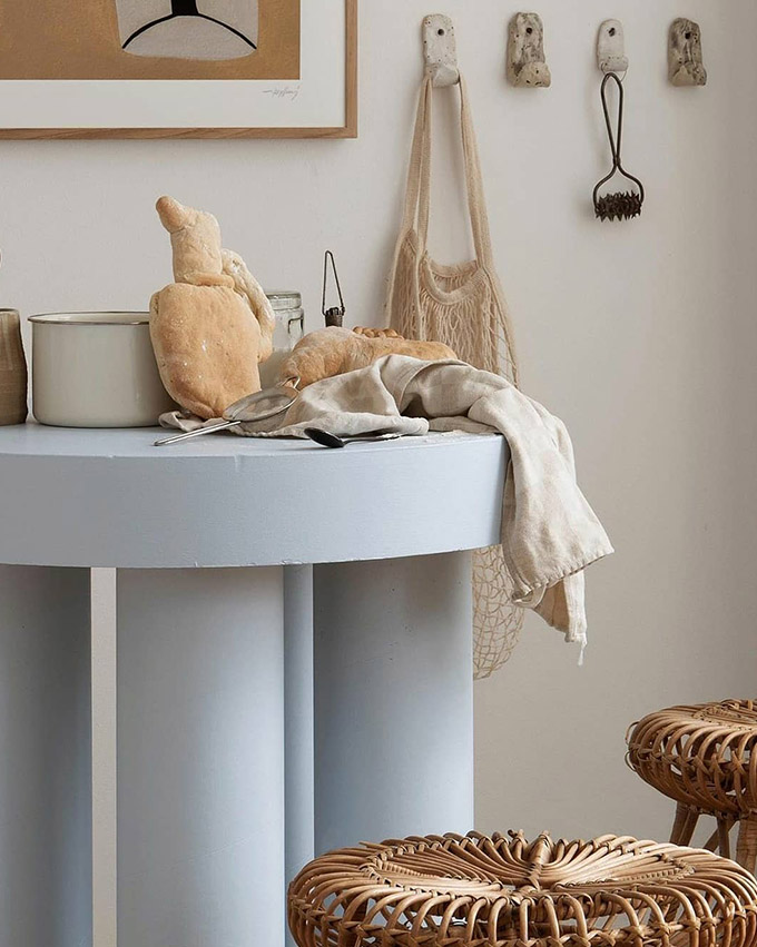
This beautiful shade is so versatile, you can use it in any room of the house. It would look great in a bedroom as it creates a sense of calm and peace.
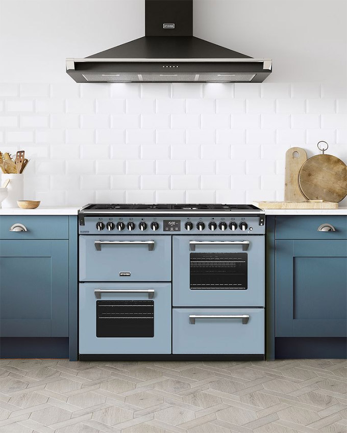
In the kitchen, this color would make a great backdrop to show off your new modern appliances or as a fantastic accent colour to pop against wood decor and vintage accessories.
Dulux even partnered with appliance manufacturer Stoves UK to create beautiful ovens in Bright Skies – check it out below!
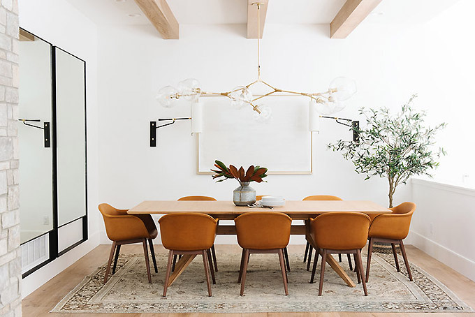
Bright Skies would also look incredible in a traditional dining room, especially alongside dark wood furniture or with hints of gold for that luxurious feel.
Try painting the walls of your room this beautiful shade, and then go one step further and paint the doors and trim as well. It will give your space instant impact.
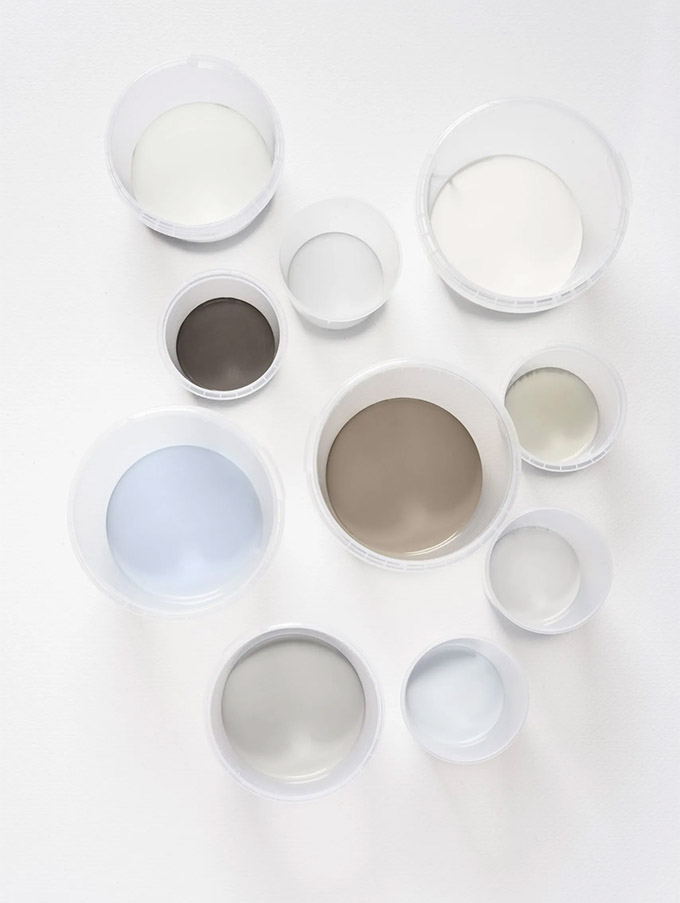
Dulux suggests 4 colorways for Bright Skies to help you decorate your home; they are Greenhouse, Salon, Studio and Workshop. You can find out more about each palette here.
My favorite palette to pair with Bright Skies is definitely the Salon palette, pictured below:
Decor & accessories inspired by Dulux Bright Skies
If you’re not quite ready to take the leap and paint your walls, then you can always introduce this color into your home through other accents and accessories.
Scroll to see some of my favorite home decor items inspired by Dulux’s ‘Bright Skies’!
Click on any of the items to shop 🙂
What do you think about this blue? Will you be using Bright Skies in any upcoming projects?