How to use Benjamin Moore Revere Pewter in 2026
This post may contain affiliate links. If you make a purchase through one of my links, I may make a small profit at no expense to you. For further information, please view my policies.
Revere Pewter HC-172 by Benjamin Moore
Is Benjamin Moore Revere Pewter still in style in 2026? Short answer: yes – if you use it the right way. Revere Pewter HC-172 is the greige that dominated real-estate listings in the 2010s, then got labelled “dated” when cooler grays took over. But with warm, layered interiors trending again, this mid-tone neutral is back on design TikTok (#GreigeRevival) and in new-build model homes.
Below you’ll find real-room photos, undertone and LRV breakdowns, the best whites and accent colors to pair with it, plus quick comparisons to Agreeable Gray and Accessible Beige. By the end you’ll know whether Revere Pewter will read cozy or murky in your lighting- and how to make it look fresh rather than 2010 beige-gray.
How to use Revere Pewter in 2026 (real room Ideas)
I’ve seen Revere Pewter work really well in homes that favor a more traditional decor style. The soft, warm yet desaturated quality of this gray paint really compliments curved furniture, moldings and rich wood tones. It could also work well with traditional farmhouse decor or even modern farmhouse (if paired with the right colors).
Even though RP is not the newest “paint kid” on the block, there are definitely still a lot of opportunities to tie it into contemporary color schemes.
So that begs the question, where can you use Revere Pewter Benjamin Moore?
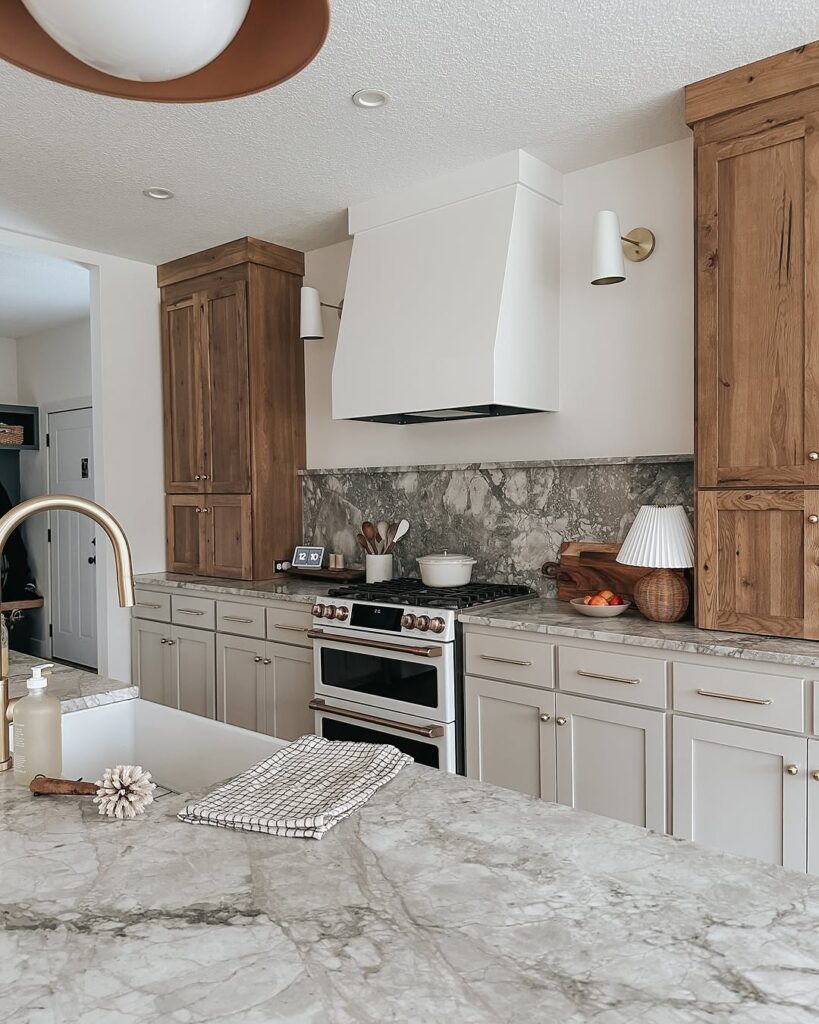
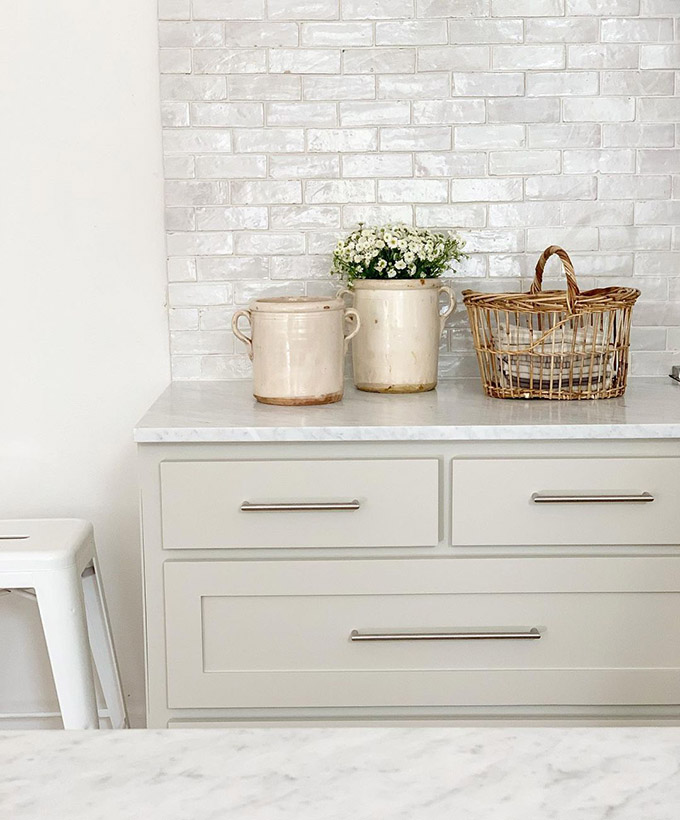
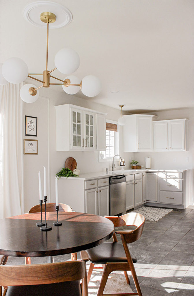
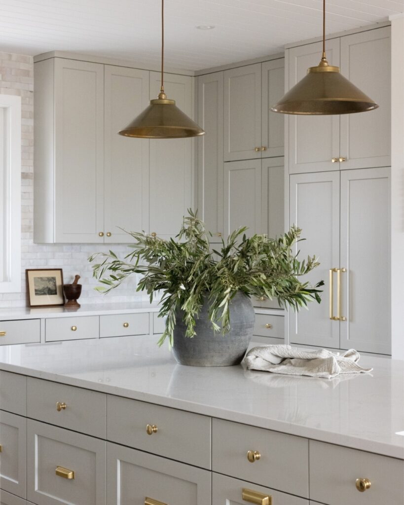
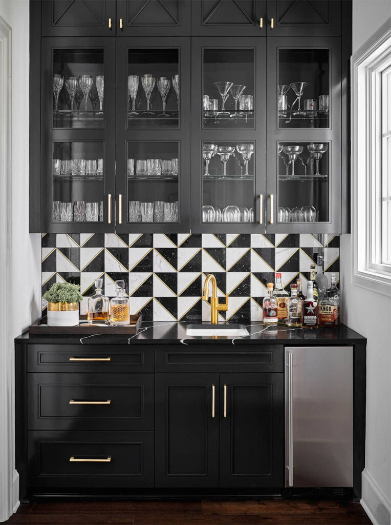
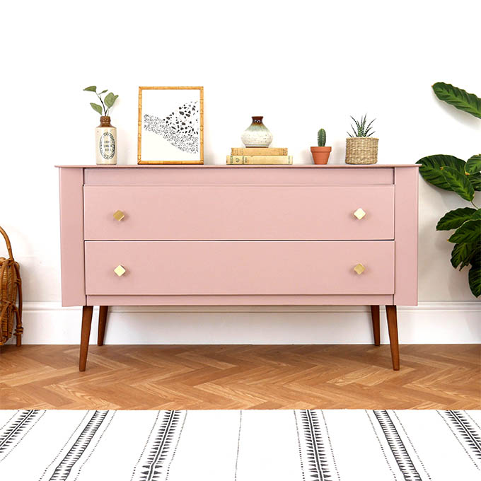
I’ve got to be honest with you, my favorite place to use Revere Pewter nowadays is not on the walls, but actually on cabinetry! Greige cabinets work beautifully paired with crisp, white walls, brass accents and black window frames. In the kitchen, paired with a marble countertop, it also looks gorgeous.
Need some proof? Check out the photos below!
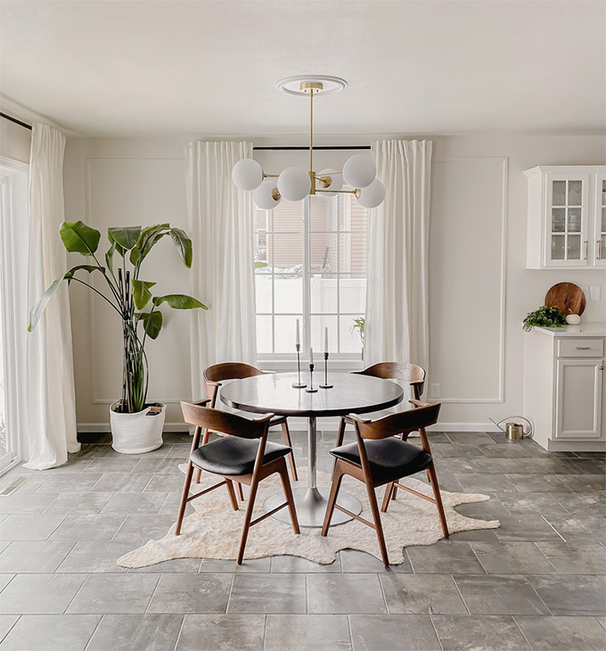
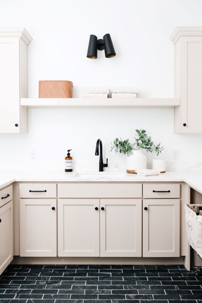
Kitchens
Using Revere Pewter on the kitchen cabinets is probably my favorite place to use this color. As you can see in this kitchen below, it also pairs beautifully with wood tones!
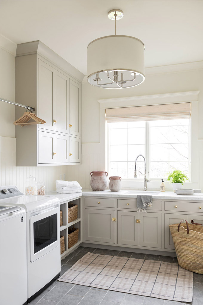
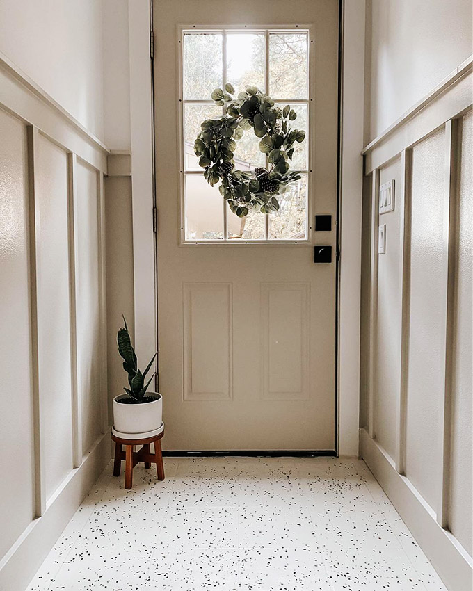
Laundry room
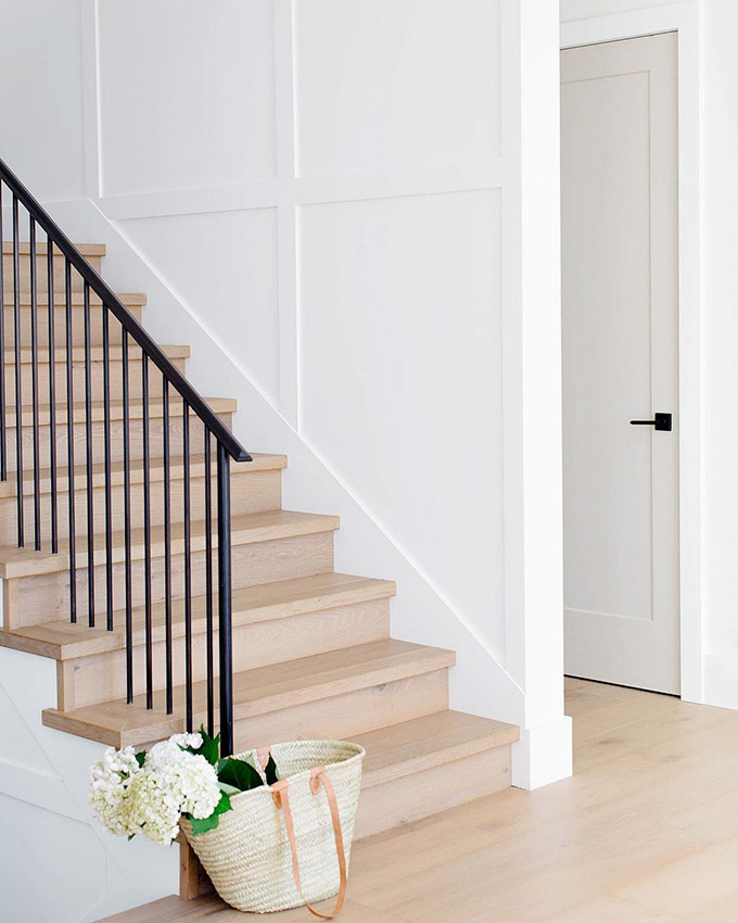
On your interior doors

Paint your doors with RP and pair with a beautiful warm white – this is similar to what Zenia from Style it pretty home did, and it looks amazing! She used a paint from Sherwin Williams called Into the Gloaming, which is very similar to Revere Pewter.
On the trim
This home owner decided to do all her interior trim and doors in Revere Pewter, and kept the walls white. It’s an interesting and original idea, as most people are accustomed to seeing the opposite, ie white trim and doors on colored walls.
If you’re not into using RP on your trim but you’re wondering ‘What’s the best white trim color that goes with Revere Pewter walls?’, then you can look to any of the white paints I mention below.
Also make sure to look at what undertones are in your drapes and other elements in your room when choosing your trim paint.
Exteriors
Another fantastic place to consider using Revere Pewter is on your home’s exterior.

A note about the trim color above: I’ve had a lot of questions about the color of the trim in the photo above. Unfortunately, I don’t know what color it is! I have tried to find online records of what color was used for the trim and have not found any information. I would have included it if I knew! My recommendation is take this photo to your local paint expert and ask them what they think, their guess is as good as mine! Then get samples and test things in real life. Never base paint decisions on photos alone.
What Color is Revere Pewter Benjamin Moore?
According to the Benjamin Moore website, “Revere Pewter is a light gray paint with warm undertones”. Don’t worry, we’ll talk more about undertones later ‘cause they’re super important! They also go on to say that it works particularly well for open floor plans.
But Revere Pewter is much more than just “gray”. It’s a truly fascinating paint because it has so much range to it. Grays can be particularly tricky because they act like “chameleon” colors, and Revere Pewter is no exception.
Revere Pewter is sometimes described as “muddy”. This can scare people off because the term muddy has a negative connotation. In reality, the phrase “muddy color” is just a term used to describe grays, browns and other “mixed”, desaturated colors. There’s nothing bad about it. It just means that it’s not a clean and pure, vibrant color!
It’s crucial to keep in mind that gray/beige/greige paints will change dramatically based on what exposure your room has, what kind of artificial lighting you’re using, and even the color of the flooring, furniture and decor that is used in your space.
So just because Revere Pewter looks perfect in a photo on Pinterest, it doesn’t mean it’s going to look that way in your own home! There are a lot of factors that determine how a color plays in a room. Not to mention the professional lighting, staging and post processing that happens in professional photography. So just remember that when you’re looking at photos online or in magazines.
Revere Pewter Undertones
(If you don’t know what undertones are, read this post!)
It might seem counterintuitive that a paint with green undertones would be considered warm – after all, isn’t green a cool color?! Well, it depends which green you’re talking about! In the case of Revere Pewter, the undertone is comparable to an olive green, which is a warm green. Hence the color being considered a warm greige.
I would say about 85% of the time, this gray paint will appear to have a slight tinge of green to it, giving it an earthy, desaturated, mellow & dulled-down feel. If this is something that bothers you, then you’ll probably want to stay away from this paint!
I’d also advise against using Revere Pewter in a room with pink toned tiles or carpet. Color behaves in relationship to the colors surrounding it. Because red and green are complementary colors, if you pair a paint with green undertones to a floor with pink undertones, your walls will just end up looking very green and your floors very pink.
Revere Pewter’s Light Reflectance Value (LRV)
LRV expresses the percentage of light reflected from a surface. LRVs range from 0-100, with 100 being pure white and 0 being pure black.
Revere Pewter’s LRV sits at 55.51, so right in the middle in terms of how much light the colors reflects, and how much light the color absorbs.
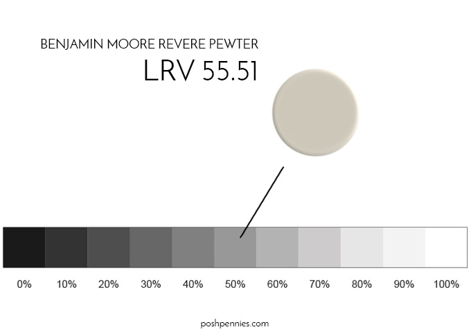
What does this actually mean though?
Well, if you are considering Revere Pewter for a room that doesn’t get a lot of light, you should remember that this color doesn’t reflect an insane amount of light (since it’s right in the middle of the LRV range).
So if you’re looking to brighten your room, this wouldn’t be the best paint choice – you’d want to opt for a paint with a higher LRV (paints above 60+ LRV).
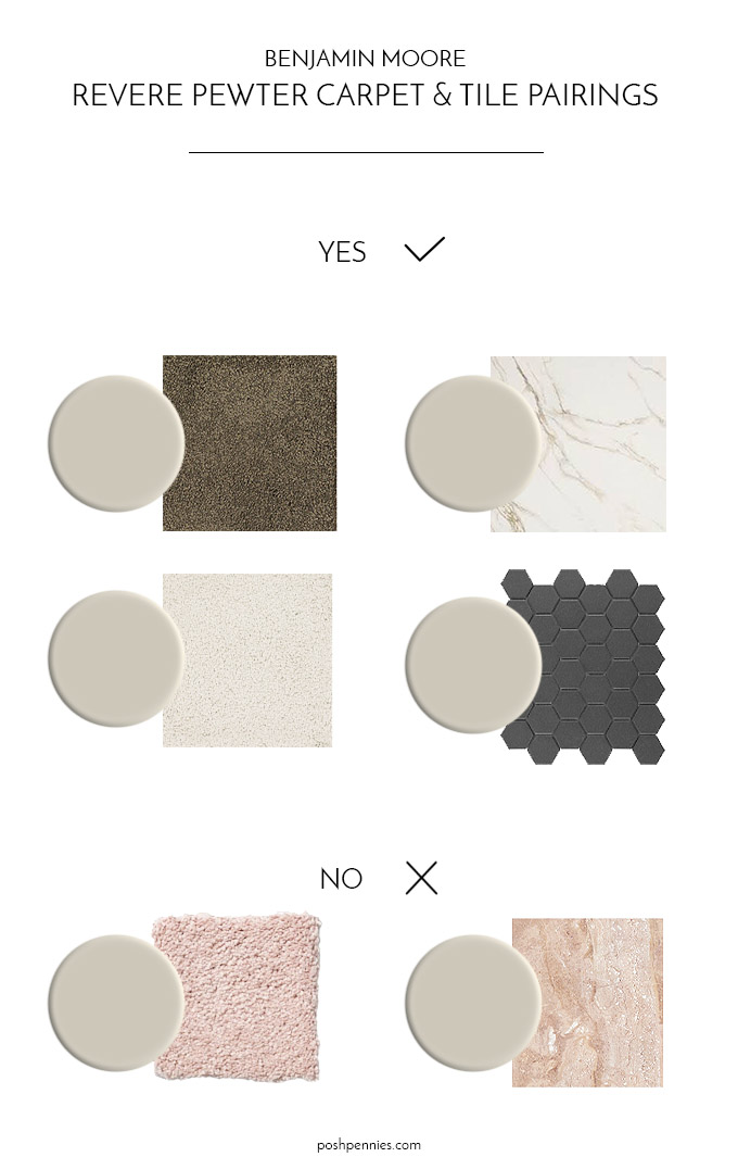
Best Accent Colors & Whites to pair with Revere Pewter
What color looks good with Revere Pewter? This is a super common question. It’s understandable that so many people would be interested in an answer to it – picking paint can be a bit overwhelming!
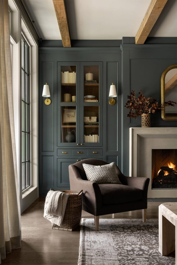
About 10 years ago, people were mainly pairing sage greens, shadowy blues and browns with Revere Pewter. While these were beautiful palettes, they do feel a little dated now.
It’s still possible to use RP in a contemporary way in our decade – and let me tell you, it looks like a completely new color! I think it looks best paired with deep, bold colors that provide a pop of contrast to the gray.
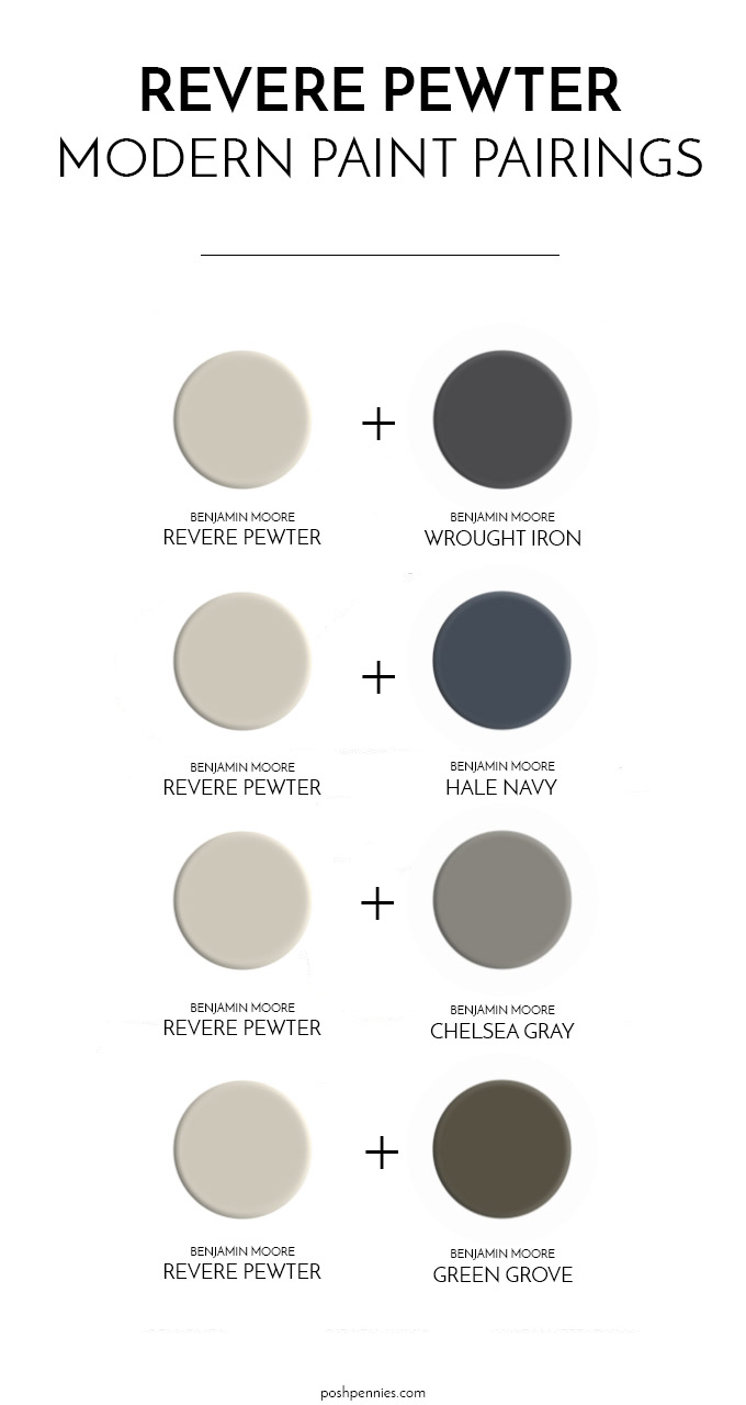
My favorite modern Revere Pewter color pairings:
- BM Revere Pewter + BM Wrought Iron
- BM Revere Pewter + BM Hale Navy
- BM Revere Pewter + BM Chelsea Gray
- BM Revere Pewter + BM Green Grove
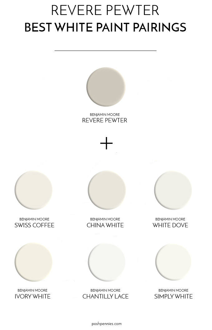
If the modern color combinations I mentioned above won’t work for your situation, but you’re still going for a contemporary take, it is still possible to use Revere Pewter. Just pair it with a heavy dose of white.
best whites to pair with Revere Pewter:
- BM Revere Pewter + BM Swiss Coffee (off white, creamy)
- BM Revere Pewter + BM China White (off white, creamy)
- BM Revere Pewter + BM White Dove (warm white)
- BM Revere Pewter + BM Ivory White (warm white)
- BM Revere Pewter + BM Chantilly Lace (clean, neutral white, neither warm nor cool)
- BM Revere Pewter + BM Simply White (multi-purpose white)
Revere Pewter vs Agreeable Gray
Sherwin Williams Agreeable Gray has a higher LRV than Revere Pewter, sitting at 60, which means it is a brighter color and reflects more light overall.
Agreeable Gray is a cooler paint and also tends to have cooler, purple-ish undertones.
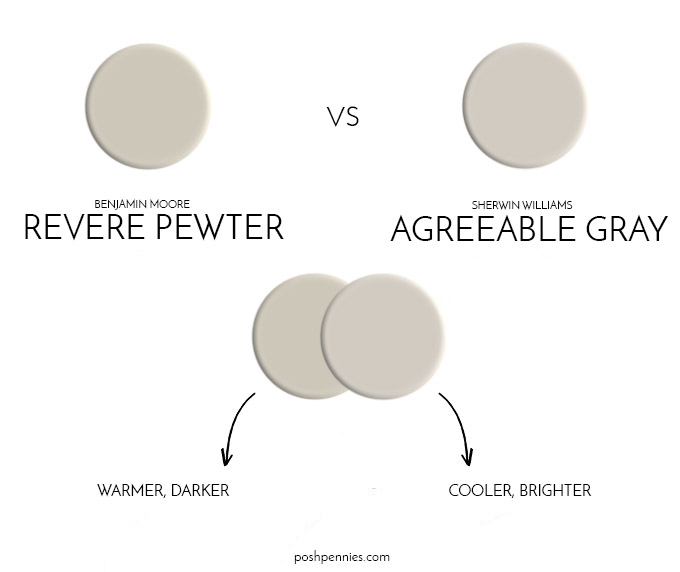
In short, Revere Pewter is slightly darker and warmer, and Agreeable Gray is brighter and cooler. When you hold the two swatches side by side, it might not seem like a huge difference. However on a large wall, these colors will look incredibly different! So choose carefully 🙂
There is a great post with lots of photos detailing the differences between these two paints. I recommend you check it out if you are not sure which gray is best for you.
TLDR: Agreeable Gray = brighter, cooler than Revere Pewter
Revere Pewter vs Accessible Beige
Sherwin Williams Accessible Beige also has a slightly higher LRV than Revere Pewter, coming in at 58. So overall it’s an ever so slightly brighter paint. It has pinky/gray undertones.
The main difference between these two greiges is that Accessible Beige is a warmer gray than Revere Pewter. Can you spot the difference?
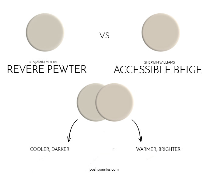
TLDR: Accessible Beige = brighter, warmer than Revere Pewter
FAQ: Revere Pewter (2026 edition)
Revere Pewter is neither gray nor beige; it is considered a “greige” paint! In darker rooms it appears more green, in lighter rooms it looks more like a neutral, warm gray.
This is very subjective, and if you’ve been reading this post, you’ll know that the answer to this question depends on a lot of different factors! I personally find RP to be a little too dark of a greige. If you feel the same way but really love the color, you can always try lightening it by 50% and see if that works better for you.
But ultimately, the way this color plays will depend on how much light your room receives (and what type of light).
Don’t just take my word for it! Laurel Bern shared an great demonstration of this strange yet very real phenomenon. The 2 side-by-side rooms shown below are both painted with Revere Pewter and yet look dramatically different due to the different exposures (the room on the right having a northern exposure).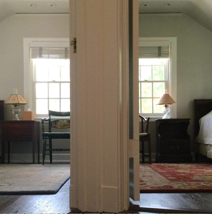
So… my recommendation is (always) to grab a sample pot, paint 2 coats on a piece of white poster board and then move the poster board around your room. Observe the way the color looks in your room at different times of the day. Also make sure to look at it with both natural and artificial lighting. Then decide.
It is my personal opinion that a paint color itself can’t really be dated. It’s the application of it, and the other elements surrounding a particular paint color that can make it look outdated.
So while Revere Pewter might be reminiscent of the late 2000s/early 2010s, it’s only going to look “dated” if you continue to pair it with the same colors and decor that was being used in that time period. If you like this paint color and it works for your home, you should definitely go for it!
Revere Pewter Color Recap & Final Take
Revere Pewter is a beautiful, albeit tricky gray to work with. Like many gray and greige paints, it is an INCONSTANT color. This means that it shifts dramatically based on the type of light source around it and other influencing factors in the space.
If the quality of light in your room has a nice, balanced mix of all the visible wavelengths, Revere Pewter will appear like a neutral, warm gray color. And if your inherent light source is cool, like blue or green, then Revere Pewter will in turn also appear blue-ish or green-ish.
- if you are looking for a fresh, clean gray, then Revere Pewter is not the ideal choice for you.
- if you are looking for a gray with cool undertones, Revere Pewter is not the ideal choice for you.
My final 2 thoughts are:
- I would prefer to use this color in a very bright room (ie south facing), where it appears as a warm, creamy greige. I find RP can be a little too tan or green in darker rooms and it becomes a little overbearing without enough light hitting the walls.
- I would experiment with RP in other ways rather than on your walls. Try reinventing Revere Pewter on your doors, trim, cabinetry, painting individual furniture pieces and on exteriors. You might be surprised at the results!
What are your thoughts on this mythical paint color? Have you used it in your home, or are you considering using it? I would love to hear your thoughts!
Check out my other free paint guides!
Benjamin Moore Edgecomb Gray: The Perfect Neutral
Simplifying Paint Undertones – What Are They & Why Are They Important?
Benjamin Moore Swiss Coffee: A Timeless Paint Color
5 No-Fail white paints top interior designers swear by

Benjamin Moore White Dove: Everything You Need To Know!
Sherwin Williams Tricorn Black: Should You Pick This Paint?
Hey there!
Did this article give you some great ideas or teach you something new? Help me keep the content coming! Simply bookmark my Amazon link and then just click it before you shop on Amazon! Every purchase you make could earn me a tiny commission, at zero extra cost to you! Your incredible support keeps this little website alive and thriving. Much love, thanks a bunch! 🌟

This was extremely helpful for me. Thank you for all the details and comparisons. I think you’ve convinced me to use Revere Pewter on exterior garage doors and I’m so glad to see you mention China White! I think China White is the perfect shade of white and not a lot of posts refer to it.
Hi! We just painted all walls in our new house SW White Duck. I love RP and want to paint the perimeter kitchen cabinets RP. The island and a hutch will be a medium walnut stain. Will RP work with my wall color?
hard to say. i suggest getting a sample pot of RP and checking yourself!
Ha, we had it in our house in the 90’s but I did love it. Never thought of the exterior in it tho, looking right now at other greysh’s as well.. I light cream/off white with a hint of grey is great for the trim too..
I have spent months trying to pick a whole house interior wall color, an interior doors color and a kitchen cabinet color. I am strongly leaning towards RP for the kitchen cabinets (very little natural light in that room). I was wondering what you think about RP darkened by 50% for the kitchen cabinets and interior doors? Does that keep the same undertones and color just darker? And then wondering about painting the interior walls Edgecomb Gray lightened? I’m also thinking Chantilly Lace for base trim and around doors? I have 2 rooms that get direct light. One is west facing and the other is south facing. The rest of the rooms get very little natural light. I’m in a 1960’s home that I am working hard to make more modern and something I can feel good about. Thank you for any suggestions, color schemes or personal favorite combos you might offer! 🙂 This by far has been the most informative article I have found on RP. My husband doesn’t want to hear another question from me about colors…. He just wants me to pick and do it. Lol.
Darkening and lightening does not and should not change the undertones, If it does, they did it wrong! 🙂 My best advice is to sample your favorite colors, and see how your space feels with them. Do the swatches as big as you can. Tiny swatches aren’t helpful!
What is the color of the trim?
Please see the note below that image explaining about that trim color.
Since 2014 I have revere pewter in my open concept front of the house, Edgecomb grey ceilings. Edgecomb grey in hallway. Main bedroom revere pewter and both bath’s Edgecomb grey. It’s just how you describe it-muddy with olive green undertone. I have loved it and only now am I considering painting everything white. I have white kitchen cabinets and Kendall charcoal island. Now I’m thinking if I paint the walls white I’ll paint the cabinets either Edgecomb grey or revere pewter. They are great colors and even after 10 years I don’t hate it.
Hi,
I am thinking about painting my cabinets Revere Pewter. Looking for a complementary backsplash. My counters are a creamy white with a slight greige vein. I’m looking at Arizona tile Flash Ivory. What are your thoughts.
I like it! Those tiles in the color ivory look to be a fantastic match for RP undertone wise. Nice choice! Paired with creamy white counters with greige veining, I think your kitchen will look gorgeous and very timeless. ♥
Thank you. Do you know the exposure of the exterior of house painted in RP, north, south, etc.?
Sorry I don’t!
What color rug compliments RP? I don’t know if I should go for a cool gray or a warm beige/cream. I have learned so much from this very thorough post. Thank you.
I’d go warm but it depends on the elements in the rest of the room as well.
It helped very much. I’m painting my entire house with RP. I’m changing from stained trim to painted trim (semigloss) and RP walls (eggshell). I’m having to leave the actual window a stained look because they’re vinyl and not paintable. By using the same color on walls and trim, it doesn’t look so chopped up. I am trying to decide what color to paint the cabinets. I’m using a quartz countertop, Calacutta Lincoln that has more beige or Statuary lava that has more gray. I’ve considered 40 or 50% RP but want to pick counter and floor before selecting a cabinet color. I really liked the floor in the first pictures. Can you tell me what it is? I’ve looked for articles on RP and this by far has given me the most information. Thank you so much. I’m not sure how your replies work but could you send any information to me at [email protected]?
Thanks, Debbie
This is a great article on Revere Pewter. I used it a number of years ago in a smaller house and agree, it looked great where the room was brighter and when the sun shined in…almost a perfect neutral! And definitely a green cast. Where the rooms were a bit darker in corners or no natural light, definitely muddier. Laurel Bern’s picture is true to my experience. I do love greens so I didn’t mind when it took on that undertone. Also, I had a poster framed that had mustard-ish (maybe a bit brighter) yellow in it and that always added that bit of nice relief of color. Not sure if that would have worked as an overall complementary color. I also wondered about lightening it in my new home where i have skylights and need a neutral in a south room. I kind of cast RP aside, but will give it another thought! Also love your idea of using it for cupboards and trim. I’m dying to try that — lighter color and darker trim. Seems to be a trend these days! Thanks again!
Revere Pewter 50% lightened is my favorite interior paint color, it ended up being a perfect off white shade even though it is not in the “white” family, I hunted forever to find the perfect lighter rich color that looks great with my furnishings and decor and at 50% lighter I do not really see any green or blue shades in it, in my home anyway.
So at 50% it is an off white? That’s interesting. I am going to try this in a sample, maybe try 25% lighter too.
Thanks.
Wow, one of the best write-ups on a single paint color I have ever read. Used this color on recommendation of staging advisor to sell my home 4-5 years ago. I didn’t love it, seemed too dark, but the sale was made in one day. Paint colors are hard to get right.
I’m glad you made a quick sale!! 🙂 I agree though, that Revere Pewter can definitely appear dark!
Hi!
I’m a big fan of RV and have it on my walls in my kitchen and dining areas. I am having my cabinets painted and I’m leaning away from white and more to off white/ivory/cream…. what colors do you suggest?
Thank you!
Erika
Sorry but I am unable to give specific paint suggestions! There are too many variables at play.
I want to paint my interior doors revere pewter and the trim white dove. What color would you suggest painting the walls?
Thanks for your help.
Can you please tell me what is trim color on the exterior home pic above body paint is Revere Pewter. I see another woman asked that same question in April 2022. I don’t see a response. Can you please answer the question and painting my house Monday. Thank you
I’m sorry but unfortunately as the home is not mine, and there is no record online as to what color was used, and if there was, I would have specified what it was, so I am unable to help you. Feel free to take the photograph to your local paint store and ask them to try and take a guess. Or they can try and color match it. Their guess is as good as mine.
Hello. I’m trying to find the name of the trim color you used on the exterior of the Revere Pewter home pictured above? It’s beautiful and warm! Thank you.
I appreciate this post SO much! I’m a diehard RP fan – I’ve tried to get away from it (to stay up with the “times”) but there is no color that comes close to it for me – I keep coming back. I’m about to paint the exterior of my home in RP and have really worried that I’ll be “dating” my house by doing so, but this has strengthened my resolve. It’s simply a classic color that doesn’t go out of style, in my opinion. I found this article while looking for a white to pair with it, and this helped tremendously – Chantilly Lace it is! Thanks again.
Hello! I am considering painting our exterior in Rever Pewter. Did you end up complete this project? If so, do you have pictures?
I’m coming down to RP for exterior. Would love to see the results.
When we built our home 4 years ago, I chose Revere Pewter for most of our home. BUT, for the walls, I had the paint mixed at 50%. Then any cabinetry we used in the kitchen was painted full Revere Pewter. I am amazed at how many people love using Iron Mountain and Hale Navy for contrast. Our kitchen island is Hale Navy and the cabinets in our master bathroom are Iron Mountain. All of our trim is white. Revere Pewter is one of the most versatile colors I’ve ever used in a home and we’ve moved multiple times. The only change I would make is a more ivory tone of white for the trim or wood stained trim, only because white shows dirt and dust and scuffs much worse than stain.
I’m curious what your wall look like at 50%? Does the revere pewter still look greige, or does it look more gray?
We’re remodeling our kitchen, and although I always thought I wanted white cabinets I’m now leaning toward RP. My walls are currently BM Edgecomb Gray. Do you think the RP cabinets would pair well with the EG? We need to do a lot of repainting, so I could go with white walls. I do love the exisinting EG walls, I’m just wondering if that’d be too much griege.
Thanks for your time!
I fell in love with Revere Pewter when I first saw it. We actually had our walls in our kitchen painted with 50% RP and the shaker-style cabinets 100% RP. The trim is a basic white and the island is Hale Navy. I love the combination. I wanted to use it in our basement living room which is going to have 2/3 high ship lap. Since I like more primitive furnishings, I thought 50% on the walls and 100% on the shiplap would look great. But, as you say, because of the lighting, it actually looks identical to each other. I also love Pashmina, but am wondering if it would be good as a contrast to RP. We’re going to try some other color combinations – perhaps Navajo White on the walls and 100% RP on the shiplap and trim. My poor husband is doing all the painting and I am driving him crazy with all these color changes. LOL. Going to try to work something out later today. Just curious if you have any other suggestions besides “green.” My furniture is mostly red, beige, and blue. Thank you so much for all the wonderful information here in your blog. I truly appreciate it. (BTW, we painted our master bathroom cabinets Wrought Iron and they are gorgeous – I almost wish we had painted the kitchen island that color.).
Hello. We have Revere Pewter in the Kitchen/Living Room/Dining Room and now want to paint our entryway and hallway and thought we want to have a bit different colour. Is there a colour that would go with Revere Pewter. We just thought having a bit of contrast might be nice and we did try Edgecombe Gray and it was too light so maybe Collingwood or Pashmina might be too dark or just do Revere Pewter because of the way it changes in lighting.
If you thought Edgecomb was too light then I probably would rule out Collingwood as well, as they have almost the same LRV, so you’d likely find it to be too light! Pashmina is quite a bit darker than Revere on the other hand. Try a sample and see if you like it!
I am painting my cabinets this color but need a wall color to compliment. Since this color will flow through my livingroom as well, Id like a more grey color rather than white. Any suggestions?
Revere Pewter cabinets
Quartz white, gray and hint of gold countertops
white backsplash
THANK YOU SO MUCH!
I love RP and have used it in an interior reno several years ago. I’m now painting my home’s exterior and am considering RP again. I have a brownish roof and warm light tone brick accent (with some gray) on front of house. The exterior is currently a mid tone tan/beige and I’d like to change to a warm lighter gray. Would RP work with Dove wing trim and is there a warm red or adobe red colour you would recommend for my front door that would coordinate with RP (and pick up the colours of my brick)? My door is currently a mid tone black which I was planning to keep but am contemplating a change. Thanks!
I have RP in a family room with lots of windows and skylights. It’s a beautiful barely there greige in that room. I have two chairs that are have teal-green and a heathered brown in them that look absolutely marvelous with the wall color. It really does make green pop!
Je cherche à créer une harmonie dans la peinture extérieure de ma maison, d’un style classique moderne des années 1950. Elle est cubique, sur 2 étages: 3 rectangles collés allant du plus petit au plus grand, très fenestrée grâce aux nombreux angles des rectangles. De son côté sud, elle regarde le fleuve.
Les fenêtres sont Kaki (Gentek 559).
Le rez-de-chaussée est en stuc, sauf la façade centrale (cube du milieu) en pierres de béton colorées.
Au 2e étage, il y a des murs en stuc et d’autres en bois (“claboard”).
En façade (50 pi) côté rue, les 3 matériaux sont présents, la pierre étant dominante au rc.
Le côté fleuve est très apparent en raison de l’angle de la rue: stuc au rc et bois au 2e.
Le Revere Pewter est joli avec le Kaki des fenêtres et la pierre de béton colorée.
Est-ce que j’utilise la même couleur sur les murs de stuc et de bois?
Si je dois choisir une autre couleur ou autre ton, que puis-je utiliser?
Je cherche à harmoniser, non à rajouter un autre élément fort, ayant déjà cette pierre.
I am finalizing my paint colors on an open floor plan new build. Most of the lighting comes from the south, some north. My cabinets are Revere Pewter/ SW Daphne Island. I’m thinking SW Fleur de sel for most walls w RP trim & doors… Floors are concrete but we haven’t picked a stain. The office off of the living area is SW Upward- would RP trim go with a light blue or what do you think about using SW pure white for the trim in this room? Is it tacky to have a different trim color in a room you can see through French doors? Pure white is the ceiling color & going any place we need a true white. Help!
Hi! I’m about to paint the exterior of my mid-century brick ranch (currently dingy blond brick.) I like Agreeable Gray, but it feels too light/bright for the exterior, and I’m wanting to lean a bit warmer.
My two finalists are SW Anew Gray and BM Revere Pewter. I lean a little more toward AG in the bright sunshine, and a little more toward RP in the shade. My house is west-facing, but has a large shade tree in the front, so it’s really quite a variety of lighting conditions. I live in Colorado, so it definitely is sunny a majority of the time.
My windows/ trim/ fascia/ gutters are all white. Front door will be SW Salty Dog (very close to BM Symphony Blue). If you have any thoughts, I would appreciate the help!!
What white did you use for the exterior trim? We’re about to paint our exterior RP, but not sure where to go on the trim.
I had all my soffits and fascia capped, so those and the gutters and downspouts are all the “Aspen white” siding color. I went in and had SW match a piece of it and it was VERY close to just white with no added color.
For five-gallon, architectural, latex, exterior, emerald, satin, extra white paint, it had 5/32 oz of N1-Raw Umber, and that’s it.
What color would be best for Kitchen, Dining and Living Room area that is north and west facing? I have cherry cabinets and floor in Kitchen and Dining with a brown/taupe carpet in the living room. My trim and ceiling are simply white. My back splash is white subway tile and a primarily off white multi-color granite counter top. I will also be getting simply white plantation shutters. I was thinking Accessible Beige or Revere Pewter, although mindful gray was too blue on my walls (but that was before the trim was repainted from a creamy white to simply white. Thanks for your help.
Hi. Thanks for this wonderful article! Next year I’m moving into a sixth floor northwest facing condo (under construction) with floor to ceiling windows. I love Revere Pewter and am planning on my kitchen cabinets and doors to be this color. I’m considering between Chantilly Lace and Oxford White for my trim and then Simply White for my walls. I’m interested in your thoughts on these selections. I’m very inexperienced at picking out paint colors so am open to other suggestions you may have. My plan is to let my artwork and furniture provide the pops of color. Lastly, making the entry door Chelsea Gray captivates me. Any and all thoughts are welcome. Oh, and my floors are natural walnut and countertops/backsplash Carrara Arabescato Porcelain. Thank you so much!!
any of those whites will work great with RP, I would personally keep trim and walls the same and just vary the paint sheen! more info about that on my how to pick white paint post here
Do you think if we used Revere Pewter in our Living Room would blend in with Shaker Beige that is on the other walls.
Shaker beige and Revere Pewter are very closely related, you can definitely notice that if you look at them side by side. I think they could work together in a palette if you are going for a soothing, beige monochromatic palette and you just want a tiny bit of variation. So yes I think it can work, but personally if it was up to me, I would probably just choose one or the other (I’m just not a fan of having different colored walls that are very close to each other!).
Great article! We are using RP throughout our living room, dining rooms and hallways. Also considering painting interior doors a bit darker, so curious how you answer Ellen’s question here above! Our trim is White Dove. Considering painting the fireplace next to the RP walls the darker grey too…thoughts? THANKS! Love your website, just found it! Great job!
Thank you! Yes I would paint the fireplace Chelsea Gray! White Dove, Chelsea Gray and RP is a fantastic combo!
great insight on R.P. I always saw an olive green undertone too (painted sample on wall in dinning room (northwest room) and I’m not a fan of olive green….per your article I’m going to check out accessible beige & perhaps into the gloaming….However, I am even more confused about choosing the right coral color for my dinning room ceiling….(northwest room with 2 windows and have morning dove I believe as my trim, old blonde wood floors) can you suggest a coral color (I have coral spice, bird of paradise, coral reef, rare beauty in mind but I don’t want too pink or too orange) for my ceiling and a neutral wall color please and thank you….the other room has hale navy on the walls…
I’m guessing you mean white dove as your trim. 🙂 It really depends on the color of the walls in your dining room, and you didn’t mention what that was, but personally I like coral spice best as it seems a little more toned down than the other colors. Bird of paradise is very red, and coral reef and vivid beauty (I assume you meant vivid beauty) are too punchy as pinks and oranges respectively.
In the process of painting all the doors and trim in our house Revere Pewter 50% darker. Love, love, love it! Trying to decide whether to paint interior front door the same or use Chelsea Gray. Just can’t decide!
Since it’s your front door personally I’d go with the Chelsea Gray 🙂 To give it a bit of its own special moment.
Will this color go well with olive green curtains with a east west exposure?
I don’t see why not!
We are about to paint our home in Revere Pewter but are struggling to find a good accent color. We want a darker toned gray/greige. We tried Chelsea Gray and its a tad dark for me. We have cathedral ceilings and an open concept home, and the accent walls will be in the middle. The large expanse of wall space makes me hesitant to use something as dark as Chelsea Gray. I’ve tried a few other colors but so many of them are too close in range to Revere Pewter. As mentioned, we want a gray/greige color (maybe even a brownish). Can you help?
If you really like Chelsea Gray but you’re just finding it too dark, I would recommend just lightening it with white. The paint store is able to do this for you. You can ask the store to give you samples of the Chelsea Gray but at 25%, 50% and 75% strength to try. So it will still be the same color, just lighter. That would be my recommendation 🙂
what are your thoughts on using this color on bathroom cabinets with black counter tops?The bathroom floors are dark grey.
Yes it could work, i would use black hardware to match the counters and lighten the space with a lighter bathmat/rug to break up the dark floors
Very informative, I find this color very calming on the eyes. I will definatly consider it!
I’m glad you found the article useful! Thanks for stopping by 🙂