Simplifying Paint Undertones – What Are They & Why Are They Important?
This post may contain affiliate links. If you make a purchase through one of my links, I may make a small profit at no expense to you. For further information, please view my policies.
What In the heck are paint undertones?
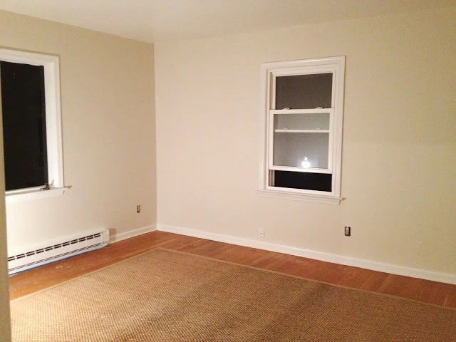
Picture this: You stroll through the paint aisle, captivated by the array of gorgeous swatches. With confidence, you choose a color that speaks to your style and vision. You buy a gallon, go home, and start painting. An hour or so later, you find yourself staring at what you feel is a completely different shade from the one on that initial paint chip. The feeling can be almost as horrifying as when your hair dye goes wrong – it really can feel like a color transformation gone wrong!
You’ve just experienced the intriguing (sometimes baffling/frustrating/confusing) power of paint undertones. 🖌️
But don’t feel bad – honestly, I cannot tell you how many times I’ve looked at a teeny tiny paint chip, then sampled it on my walls and discovered that it looked like a totally different color from what I imagined it would look like. The more mistakes you make with paint, the more you pay attention to these things BEFORE painting the whole room! 🤣
So what are paint undertones, exactly, and how can you work with them to make sure you get the paint color you’re looking for? Let’s take a closer look.
In this guide, we’re diving into the mysterious world of paint undertones and why they hold such significance when it comes to selecting the perfect color for your space. We’ll unravel the secrets behind warm versus cool undertones, explore why undertones matter in the grand scheme of design, and even share some tips on how to identify and choose the right undertones for your home.
So grab your paintbrush (or just a cup of your beverage of choice!) and join me on this adventure into the ✨captivating realm of paint undertones✨🤣. Let’s make sure your next painting project leaves you feeling delighted rather than bewildered!
Understanding paint undertones
All paint colors are made from color formulas, or by mixing various colors together. The result is the main paint color you see, or the “masstone”. The undertones are the colors that went into creating the masstone.
Paint undertones refer to the subtle hues that are present within a paint color, beyond its dominant or apparent color (the masstone). Undertones are generally read by the eye as “secondary colors” in a paint color. Basically, they’re the colors that really come out to play only once you’ve painted the whole room, so it’s best to know what you’re getting into before picking up that paint roller! 🤣
So, let’s look at some examples:
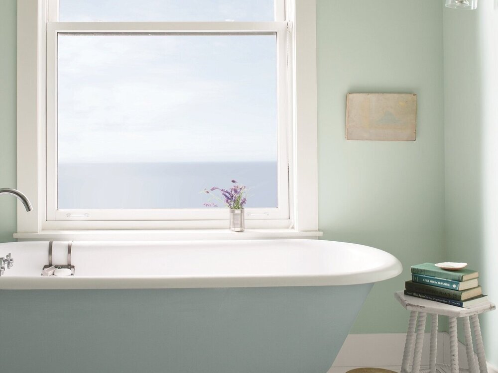
A blue paint with green undertones, such as Palladian Blue by Benjamin Moore, pictured on the walls in the bathroom below. You can see how evident the green undertone is especially when placed right next to the tub, which is painted in a “truer” blue, called Breath of Fresh Air:
Or a beige that looks pink in certain lighting (probably because the paint *IS* a pink beige – read all about pink beige over on lovely color expert Maria Killam’s blog). Such as Benjamin Moore Maritime White, an example pictured in the room below:
In these cases above, the green and pink would be the undertones, respectively.
Without undertones, we’d have just three paint colors: the primary colors of red, blue, and yellow. These are the only 3 colors that aren’t made by mixing two or more colors together.
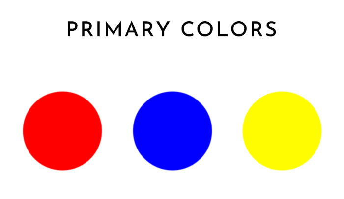
So, undertones are an essential part of creating the limitless variety of paint color options we have available today. Virtually every paint color has undertones, so you can see why it’s important to understand them.
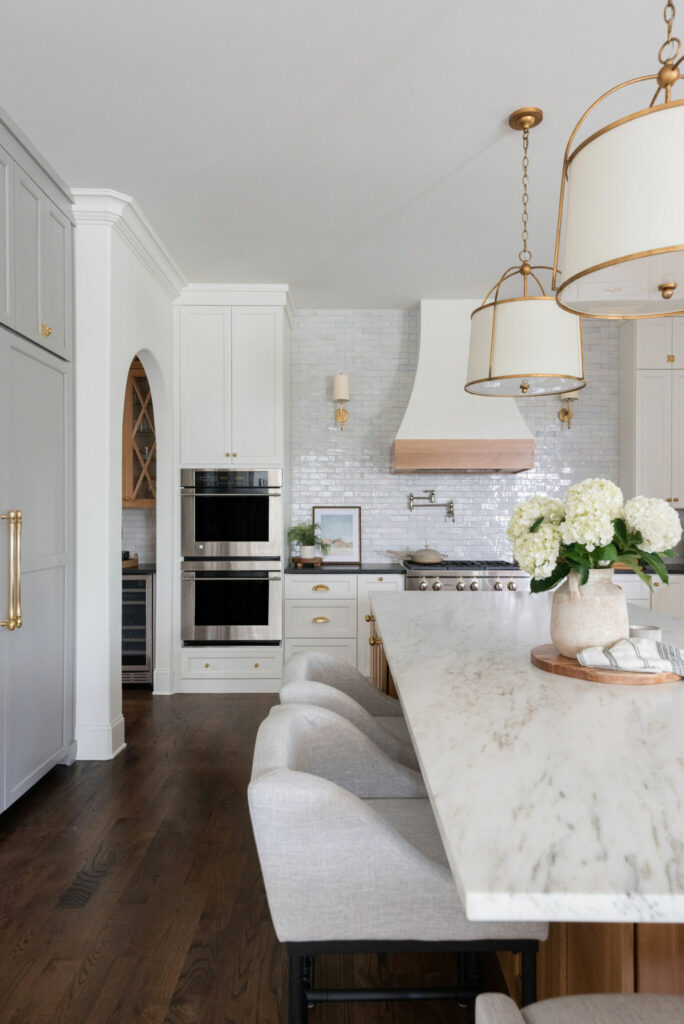
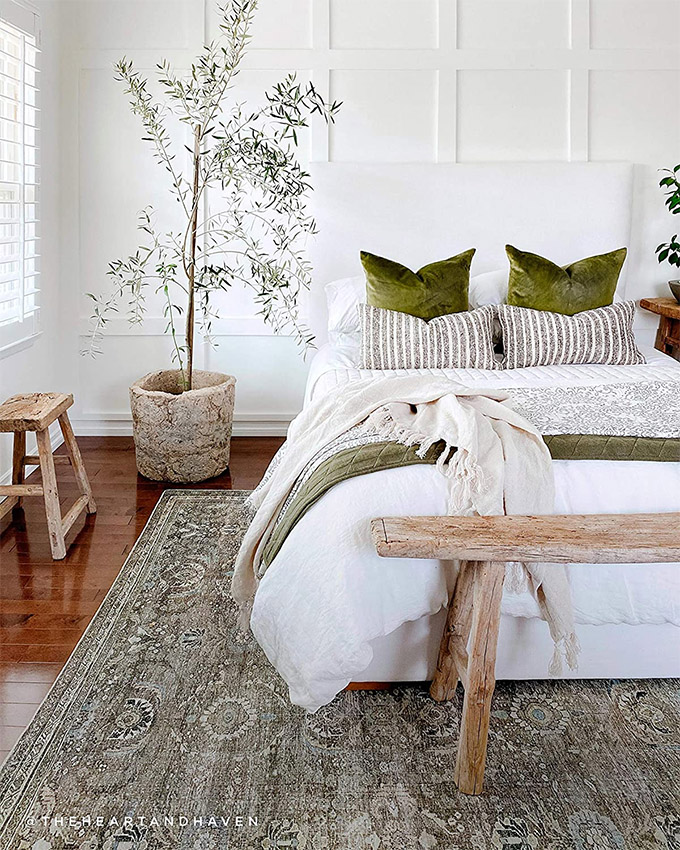
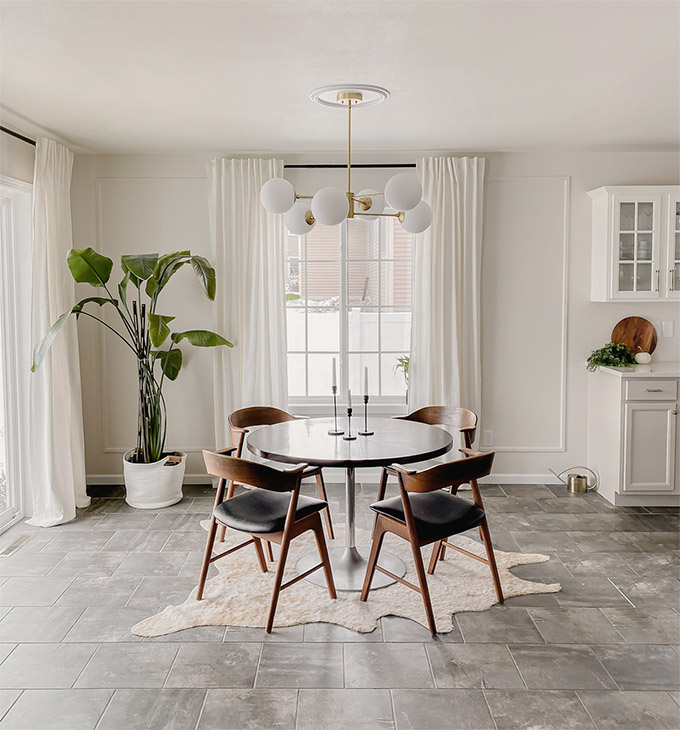
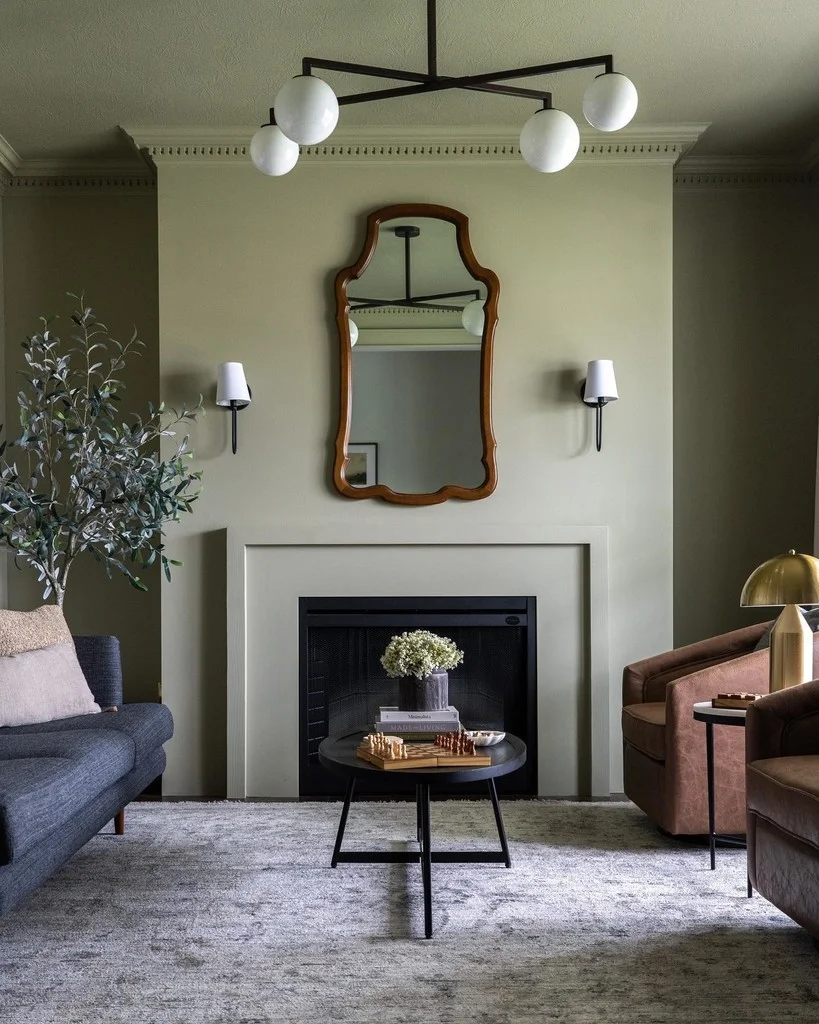
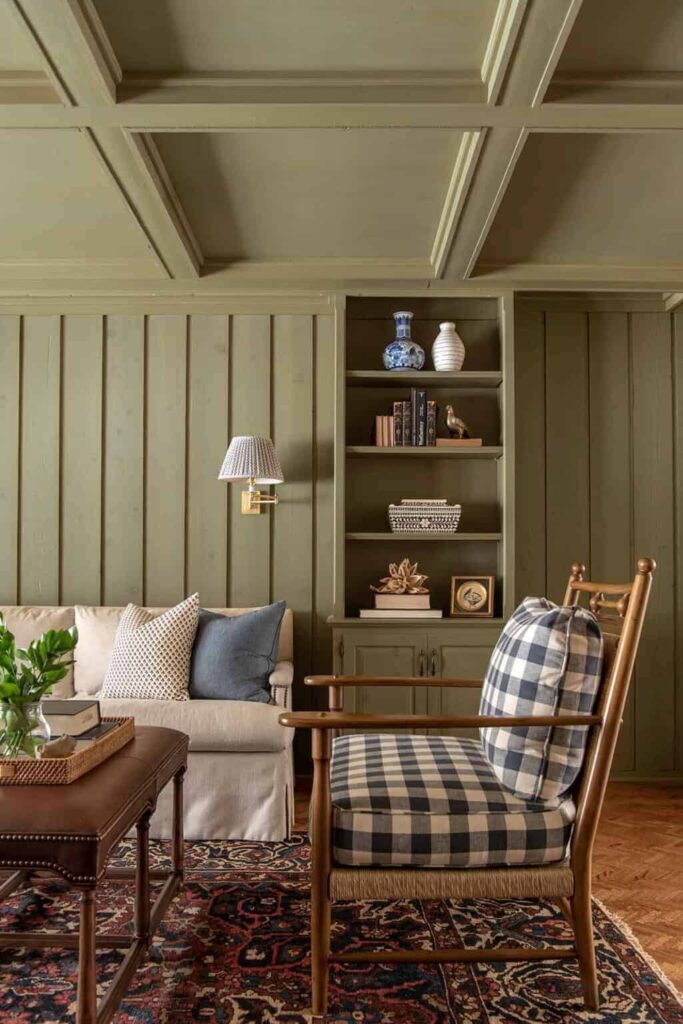
Take Benjamin Moore White Dove, seen in the kitchen image above, for example. It’s a paint beloved by designers and homeowners for its subtly creamy, warm white shade. It’s a bright white, but it’s not stark or sterile. That subtle warmth is thanks to the yellow and green undertones mixed into the white paint. While the paint generally looks like a true white, the green and/or yellow colors can become slightly more visible depending on where it’s used.
Warm VS Cool undertones
Undertones also play an important role in determining which paint colors are “warm” and which ones are “cool.”
Cool-toned paint colors generally have blue, green, or purple undertones.
Warm-toned paint colors generally have red, yellow and orange undertones.
Neutral-toned paint colors are paint colors with no obvious undertones. Paint colors with neutral undertones are often considered “balanced” or “without a strong bias”. But make no mistake, in reality almost all “neutral” paints still have a subtle undertone, which is why it can be so difficult to work with neutrals. But that’s a post for another day…! 😅
Why are undertones important?
In the most basic sense, undertones are important because they impact how we see color. This is why almost any paint color or design expert will tell you to test paint colors in your home before you commit to one.
Undertones can also help you pick out furniture, artwork, and other design elements to match your paint scheme. If you use colors with similar undertones in different parts of the room, it will make the space look harmonious and beautiful.
It’s also important to understand that undertones become more (or less) apparent when you place contrasting colors together. So, if you have a gray paint color with a green undertone, and you place it in a room with lots of tan colors, the green hue will become even more apparent. On the other hand, if you were to place the same gray-green paint color in room with lots of blue-green colors, the gray hue would stand out more.
Here’s an example:

In the graphic above, I’ve placed the color Farrow & Ball French Gray (in the circles) against two different background colors: the cool-toned Benjamin Moore Wales Gray (left), and on the warm-toned Benjamin Moore Revere Pewter (right). See how different the gray circle looks depending on the background color it’s placed on?
Lighting, light color temperature, and most of all THE SURROUNDINGS in a room all play a role in how undertones are read by the eye, so it’s crucial to test out paint colors in your space before you commit!
How do you know what undertones a paint color has?
There are a few ways to figure out what undertones a paint color has:
- The first is to simply test out paint colors in your home. If you love a paint color, go home and try it on your walls. You’ll easily be able to see if a color starts to look more blue, or pink, or green.
- The second way is to look at a color’s RGB, or Red, Green, Blue code. More on that below.
RBG values and Paint undertones
Most paint suppliers have this code listed with each paint color on their website. The RGB code tells how much red, green and blue a color has, in that order. RGBs are listed as three numbers in a row, with each number specifying how much Red, Green, and Blue is represented on a scale of 0-255.
Colors with high Red levels have more red and are warmer, colors with higher Green or Blue are cooler. When all three RGB levels are equal (or nearly equal), the color is considered a neutral paint color with NO undertone.
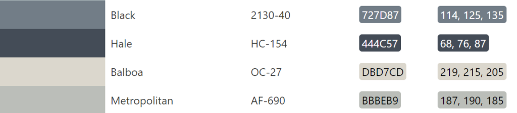
For example, the RGB of Benjamin Moore Hale Navy is 68, 76, 87, which makes it a cool-toned color because it has the highest amount of blue.
Here are a few more examples of popular paint colors and their RGB levels:
Cool-toned colors:
- Benjamin Moore Rich Black: 1, 11, 19
- Benjamin Moore Black Pepper: 114, 125, 135
Warm-toned colors:
- Benjamin Moore Revere Pewter: 204, 196, 184.
- Benjamin Moore White Dove: 240, 237, 228
- Benjamin Moore Balboa Mist: 219, 215, 205
Neutral colors:
- Sherwin Williams Tricorn Black: 44, 43, 44
- Benjamin Moore Decorator’s White: 236, 237, 234
- Benjamin Moore Chantilly Lace: 244, 246, 241
Understanding RGB is simply a tool to help you decipher what undertones you might see in a paint color and narrow down your choices.
How do you choose paint undertones?
Ideally, the undertones of your paint should complement the decor in your home by matching the undertones of the furniture and other design elements in the room.
If the decor in your space includes warm camel colors and wood tones, consider choosing a paint color with warm undertones to complement the existing elements and create a cohesive look. This could be a subtle warm beige or a richer hue like caramel, depending on your personal style and the mood you want to create in the room.
If you decorate your living space with lots of blues and greens, creating a calm and relaxed environment, choosing a paint color with cool undertones will complement and enhance the soothing atmosphere. Cool colors like blues and greens evoke feelings of tranquility, making you feel more at ease in your home.
Of course it’s always good to experiment, but if you’re just starting out, maybe feeling confused and trying to create a cohesive color scheme, a good place to start is by matching warm undertones with warm, and cool undertones with cool, in order to avoid any unwanted color clashes.
Understanding paint undertones empowers you to make informed paint decisions that align with your desired color coordination, atmosphere, lighting conditions, and architectural features. It allows you to create a harmonious and visually appealing home environment that reflects your personal style and preferences. With a basic understanding of paint undertones, you’ll be in a much stronger position when picking paint for your walls! If you have any questions, leave me a comment below!